© 2024 Loyalty Makers BV
MEREM
UNIQUE AND DISTINCTIVE
Merem Medical Rehabilitation is where people with disabilities due to complex problems can turn to for accurate diagnosis and treatment.
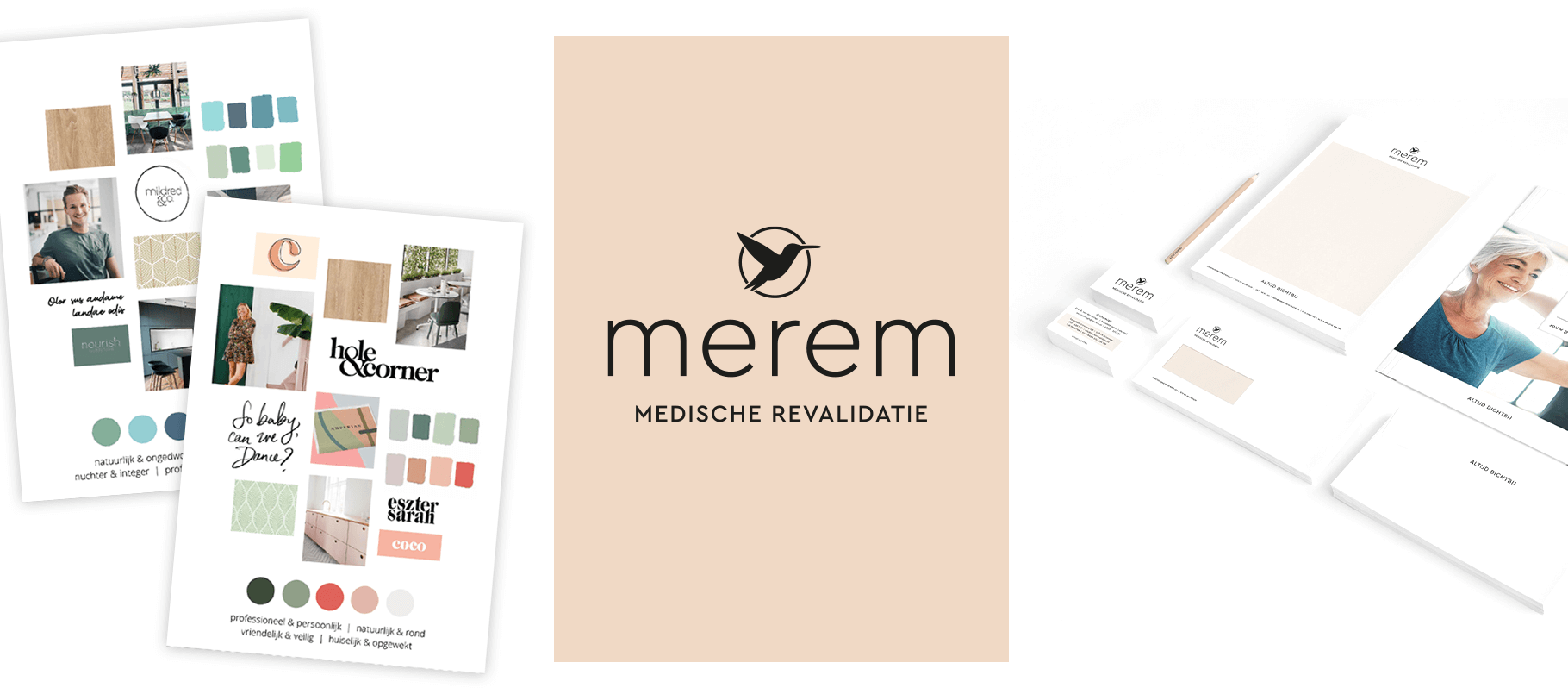
Loyalty Makers has developed a new corporate identity for Merem. Following an inspiring conversation, we created two mood boards with the client to determine the right direction. With positive feedback on the mood boards, we proceeded to design a logo and a suitable color palette for both offline and online use.
We presented four logo options, and ultimately the logo featuring the hummingbird was chosen, as its meaning aligns perfectly with Merem:
- The hummingbird, a resilient creature, symbolizes the often challenging rehabilitation journey.
- There are 340 species of hummingbirds, just as there are different individuals and treatment plans.
- Despite its delicate appearance, the hummingbird possesses impressive endurance, with some species flying up to 1,000 km without stopping.
- The hummingbird cannot walk or jump but only moves sideways. Similarly, creative treatments work to maximise results within the patient’s limitations.
- The circle symbolizes the goal, where the patient ultimately “flies” back to a normal life, completing the circle (normal life > rehabilitation journey > normal life).
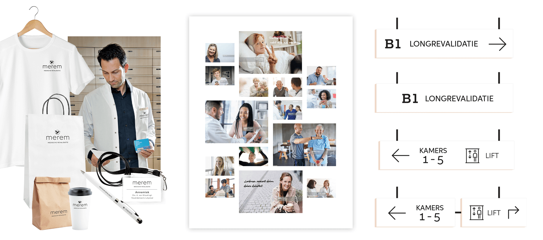
After fine-tuning the logo, we further developed the stationery. We proposed a photography direction and created designs for the signage across the entire Merem premises, both indoors and outdoors, including the associated buildings. Additionally, we made suggestions for using the logo on merchandise. All of this is summarized in a brand identity manual.

